About the project:
“Więcej niż LEK” is a Medical Information Portal which is used to run high quality e-learning courses for students and graduates of medical colleges, which prepare them for, among other things, for the Final Medical Examination and the Final Medical and Dental Examination.

Company size: At the time of project implementation – 4 employees, currently – 60 employees.
Company departments involved in the project : CEO, COO, marketing
The challenge:
The first comprehensive online course on the Polish market for medical graduates preparing for the Medical Final Examination was created at “Więcej niż LEK”. As this was a new format for would-be doctors accustomed to learning together traditionally, in homes and libraries, it needed to be implemented accordingly.
The course itself was different than courses from other fields. Aside from normal classes, it also included mind map notes, a community to help students learn together, and a study plan.
All of that had to be presented in under 1.5 minutes. Of course, in line with the design aesthetics of the new course website.
Goals:
- Convincing the audience to learn more about the course,
- And to sign up for the e-course with a ~400 € price tag
Solution:
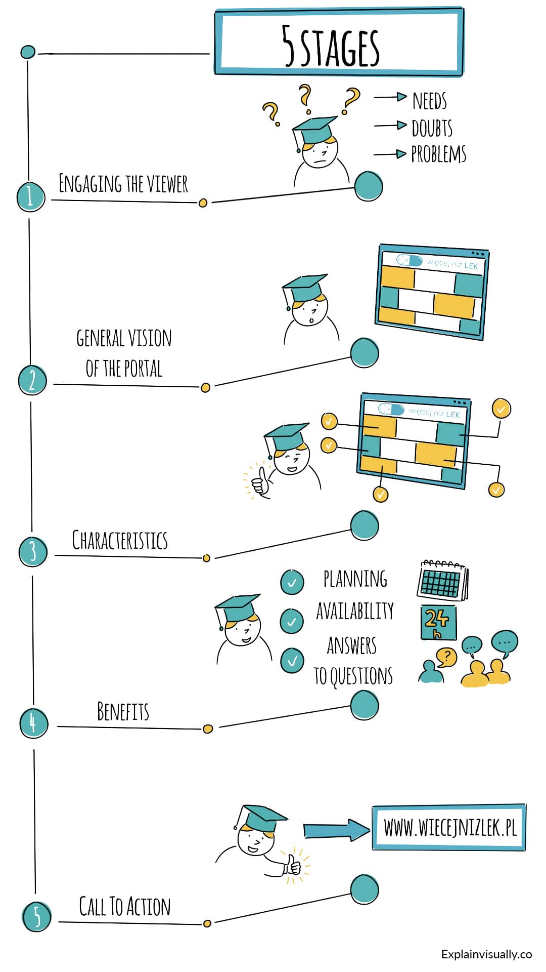
Working together with our customer, we have created a 5-stage whiteboard animation.

5 stages of the project whiteboard animation
Stage 1 – Engaging the viewer
We refer to a fresh medical school graduate, preparing for the Final Medical Examination (LEK) – their needs, doubts, problems. Thanks to this approach, when they encounter the animation, they can immediately think “Oh, this is about me!” and be naturally motivated to watch more of it.
Stage 2 – Presenting the general vision of the portal
As the portal is composed of many elements, we needed to first present a sketch of its general vision. We built a container in the viewer’s head, which we then use to store blocks with defined solutions.
Stage 3 – Talking about particular characteristics of “Więcej niż LEK”
At this stage, we talked about what is included in the course, and mentioned characteristics which make “Więcej niż LEK” different than other online courses.
Stage 4 – Benefits
We showed the benefits of using the portal. They included proper planning of preparation for the exam, availability of the portal 24/7, and the possibility to receive answers to questions from the community.
Stage 5 – Call to Action
We decided to encourage the viewers to visit the website. That was because they were not yet convinced to pay for the course at that stage – they needed more information before making an investment of 400 €.
That’s why they could find additional information on the wiecejnizlek.pl website, helping them make the decision to sign up.
The animation was used on the Landing Page, Facebook and YouTube.
Whiteboard animation about the “Więcej niż LEK” course
Results:
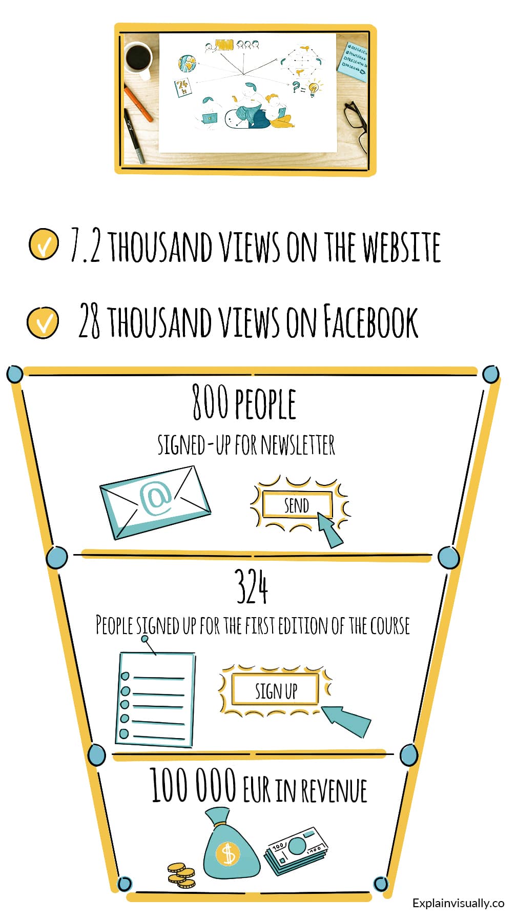
In the first few weeks of the video campaign, the company has received 800 newsletter sign-ups, which translated to 324 people signing up for the first edition of the course. That meant over 100 000 € of revenue generated.
“Więcej niż LEK” continues to use the animation to this day – the video has 7.5k views on the company’s website, and almost 30 000 on Facebook.

Results of the whiteboard animation campaign
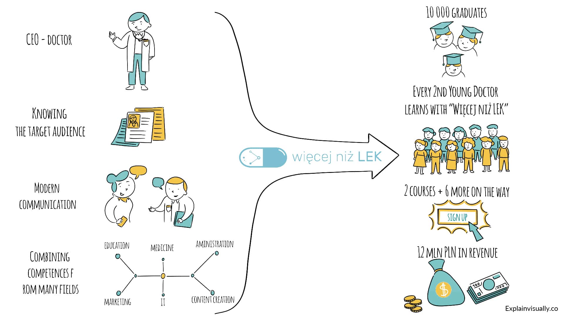
During that time, the company developed significantly. They have educated 10 thousand graduates, offers two different courses and is working on preparing 6 more. Today, every second young doctor in Poland uses courses on the “Więcej niż LEK” portal.
The success directly translates to financial scores of the company. It has generated over 3 000 000 € in revenue.
And although the animation has contributed to this success after the first campaign, there were also other, much more important factors.
What influenced the company’s success the most was:
- excellent knowledge of their target audience and its’ needs: the CEO is a doctor himself,
- honest, modern communication combined with keeping their word even with smallest details,
- combining competences and experience of the team from many different fields – from medicine, through education, marketing, content creation, to IT and system administration.

The company over the years
Customer feedback:
Cooperation with ExplainVisually was well organized from the very start – we received detailed information about the process, as well as tips which helped us deal with the script efficiently.
From the very start we were amazed at how they were able to visually tell our story and convey the atmosphere of our course.
When we needed to make some changes to the animation after 2 years – we encountered no problems! The EV team has found a solution, and the animation serves us well to this day. We recommend them!

Adam Karmiński
COO @ Bethink

