About the company
Santander Bank – the largest bank in the Eurozone

Company size:
Poland (11,000 employees), worldwide (190,000 employees)
Company departments and people involved in the project:
Service Design & Design Research Department: Head of Service Design, Service Design Lead
Challenge
Santander Bank’s Service Design team created Compass, an internal standard for the service and product development process. It combines the service design approach with the agile and internal processes of the bank.
Compass is a manual that guides the bank’s employees on how to implement business ventures.

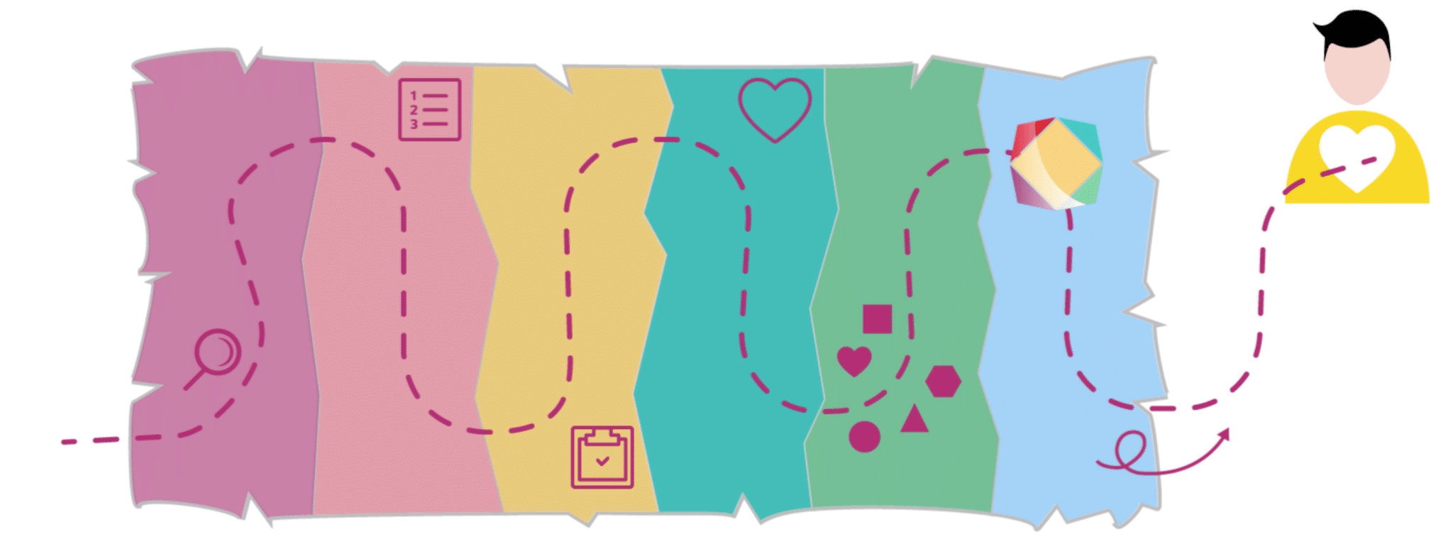
A screenshot of an animation we prepared for Santander
Compass makes it easier to avoid dead ends and create products that customers will not want to use.
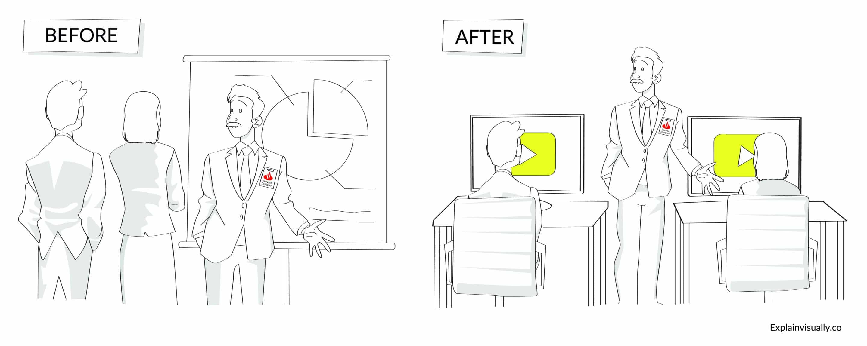
So, what was the challenge? How to make all bank employees understand how the new method works. Since the Service Design team could not train all the bank’s employees, they started looking for a solution.
Objectives:
- To tell the story of the method so that employees at different levels can understand it.
- To partially relieve the Service Design team from having to explain what the approach is all about.
- To present the whole thing in a concise and interesting form.

Obstacles
- How to convey such complex material in a simple way?
- Which elements to emphasize and which to leave out when there are many stakeholders involved?
- And how to fit it all into a few minutes?
Solution
The Service Design team approached us to produce an animation that would tell the story of Compass in a simple way.
The cooperation started with an online workshop with the Santander team.
During the meeting, we gathered the most important information about the target group and the Compass approach. We also identified potential objections and misunderstandings that could arise when discussing the new method.
We also received extensive materials about the method in PDF files and PowerPoint presentations.
Based on the workshop and the materials, we created a script that transformed the dry content into storytelling.
Then, together with the Santander team, we refined the script following two rounds of feedback.
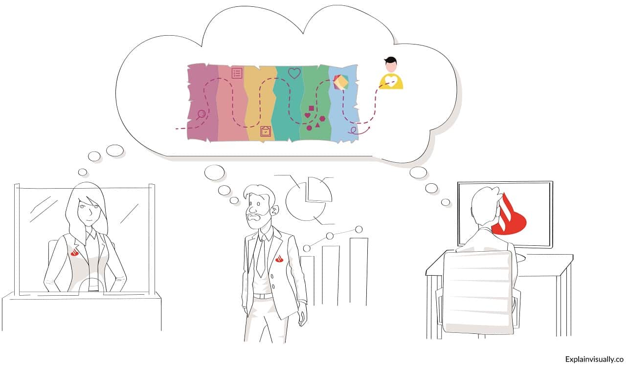
The next stage was the storyboard. Here we chose visual metaphors that illustrated how Service Design methods work. This allowed us to talk about the method in a much shorter and simpler way.
Then we prepared the first version of the animation which told about the framework in about five minutes.
However, during the tests on the audience, we discovered that we need to shorten the length of the animation. Therefore, together with the Santander team, we shortened the animation to three minutes.
The bank has made the material available on the intranet and during online training.
Icons and visualizations from the animation were included in the support articles, which discussed Compass in more detail.

Client’s Comment:
We asked ExplainVisually to create an animation synthesizing our internal, client-centric design process.
From the very beginning, it was a very positive working relationship. Maciej, who took care of the whole project, was in touch with us constantly, and showed great patience and great willingness to make changes. Thanks to his experience, he helped us through the process of creating a short and concise animation, although it was a completely new and demanding task for the Santander Bank team.
For several months we have been using this animation intensively within the organization.
Joanna Krombholz-Zabielska,
Head of Service Design & Design Research, Santander Bank

