
")
If you’ve landed here, you’re probably searching for inspiration that’ll help your message actually stick with your audience. You’re in exactly the right place. In this guide, you’ll see how an interactive explainer video can turn curiosity into clarity — and clarity into action.
We’ve spent considerable time hunting down the most engaging interactive explainer video examples on the web, and honestly, it’s been quite the journey. These aren’t just pretty animations that look nice they’re conversion machines that turn confused visitors into engaged customers.
Ready to see what makes these videos so bloody effective?
Animated explainer videos – what exactly are we talking about?
Before we dive into showing you these brilliant examples, let’s make sure we’re all on the same page about what an explainer video actually is. Not everyone’s familiar with the term, and that’s completely fine.
An explainer video is essentially a short animated or live-action film typically between 60 and 90 seconds that breaks down your product, service, or concept in a way that’s dead simple to understand. Think of it as your elevator pitch, but infinitely more engaging because it combines visuals, narration, music, and storytelling into one compelling package.
What makes an effective explainer video?
1. Length: 60-90 seconds.
2. Structure: problem – solution – action.
3. Multi-sensory storytelling.
4. Benefits over features.
5. Simplifies without dumbing down.
These videos typically follow a straightforward structure: they identify a problem your target audience faces, introduce your solution, explain how it works, and end with a strong call to action. In an interactive explainer video, this flow turns into guided, clickable moments that move viewers from problem to solution with zero friction. This problem-solution narrative keeps viewers engaged because they see themselves in the story.
From our experience working with hundreds of clients across diverse industries, we’ve seen firsthand how animated explainer videos can transform business communication. That help your audience understand complex topics quickly and remember them longer. The combination of visual and auditory information means viewers process and retain the message far more effectively than they would from reading text alone.
Top 10 interactive explainer video examples
Now here’s where it gets interesting. We’ve selected ten exceptional examples that showcase different animation styles, storytelling approaches, and industries. Each one teaches us something valuable about creating engaging content.
1. Dropbox – the explainer video that started it all
Brand: Dropbox
Explainer type: Whiteboard Animation / Cutout Style
Why we included this in our TOP 10?
Back in 2009, a relatively unknown startup called Dropbox created what many consider the most famous explainer video in history.
- First, the visual style was unique and eye-catching without being overwhelming.
- Second, the narrative structure followed a perfect problem-solution-benefit flow.
- Third, it spoke in plain English, avoiding technical jargon that would alienate non-technical viewers.
Here’s something most people don’t even realise. This wasn’t some massive corporation with an unlimited budget. It was a relatively unknown company that spent around $50,000 with Common Craft to create a simple cutout animation. It proves an interactive explainer video doesn’t need a blockbuster budget to deliver blockbuster results. And that video? It became the stuff of legend.
The genius of Dropbox’s explainer lies in its relatable setup. It opens with a familiar frustration forgetting your phone, keys, or wallet then draws a parallel to digital files. This metaphor made cloud storage instantly understandable to everyday users.
The video used iconic, simplified characters that anyone could relate to, regardless of background or technical knowledge.

When you watch the video on YouTube, make sure to scroll down and read the comments. Viewer opinions speak for themselves. Even 15 years later, people still call it“one of the very first explainer videos” and “a brilliant representation” that works just as well today as it did back then. That’s the mark of truly timeless communication.
2. Roche Diagnostics (Zinc Platform) – Vector Animation
Brand: Roche Diagnostics Polska (Zinc Platform)
Explainer type: Vector Animation / 2D Motion Graphics
Now we’re going to talk about one of our own projects here and there’s a good reason it made this list. We created this vector animation for Roche Diagnostics to explain their Zinc platform, and honestly, it’s a good example of how B2B explainer videos should work when they’re done right.
Why we included this in our TOP 10?
The brief was straightforward but challenging: explain Zinc, a compliance and communication platform for HR departments across multiple markets, in a way that makes busy professionals stop scrolling and actually pay attention. We knew immediately that starting with product features would be death😆.
Instead, we opened with a situation everyone knows. Twelve chat windows open, messages getting lost somewhere, and you need a specific expert right now but don’t know where to look. Every HR professional has lived through this. People see that problem and immediately know it’s about them. Then we show Zinc: one platform, everything in one place, instant access to specialists across the entire EMA region.
What we’re particularly proud of here is the pacing and visual restraint. The client needed something that matched their platform’s aesthetic: linear, clean, no unnecessary flourishes. Vector animation delivered exactly that, but it also gave us the flexibility to show the software interface clearly without cluttering the screen.
Read also: Top 10 B2B explainer video examples to inspire your business strategy
3. Crazy Egg – turning data visualisation into revenue
Brand: Crazy Egg
Explainer type: Whiteboard Animation
Most SaaS companies face this exact dilemma: your product solves a real problem, but explaining it in under two minutes is incredibly difficult. Crazy Egg knows this struggle well. They offer heat mapping technology that reveals exactly where website visitors click, scroll, and give up. It’s genuinely useful, but…
it’s also the kind of thing that sounds boring when you’re describing it.
So what did they do? They partnered with Demo Duck to create something clever. Instead of presenting data visualisations and analytics jargon, they put the whole story in the hands of a charming cartoon egg with a moustache. It shows how an interactive explainer video can turn dry data into a guided, character-led journey that invites clicks, not eye-rolls. The character becomes your guide through the problem and solution.
Why we included this in our TOP 10?
The genius is in the simplicity!
– hand-drawn illustrations,
– minimal animation,
– a straightforward voiceover.
No bells and whistles, no trying to impress with fancy motion graphics. Just a clear explanation of what the product does and why you should care.
4. Duolingo – “What is your Duolingo Score?”
Brand: Duolingo
Explainer type: 2D Character Animation / Mascot-Driven
This Duolingo video introduced the Duolingo Score in July 2025, a metric that shows what you can actually do with a language, aligned to international standards like CEFR.
Rather than focusing on test results, the video shows practical ability levels through character examples:
– Lynn at 5 uses basic Spanish phrases.
– Lily at 29 has casual Japanese conversations.
– Falstaff at 130 speaks French fluently.
Why we included this in our TOP 10?
The animation is playful, the characters are instantly recognizable, and the message is crystal clear: this isn’t about passing tests, it’s about actually being able to use the language. That’s why this video works. It celebrates real progress in a way that feels rewarding.
5. Spotify – “Meet AI Playlist”
Brand: Spotify
Explainer type: Motion Graphics / App UI Demo
Spotify released AI Playlist in September 2024, and their video approach was refreshingly different. Instead of explaining how AI algorithms work, they just showed what it does. You type something like
“Indie folk playlist to give my brain a big warm hug”,
and a personalized playlist appears instantly.
Why we included this in our TOP 10?
The genius is in the restraint:
NO FEATURE DUMPS!
NO TECHNICAL JARGON!
Just a visual demonstration of the experience. Since launch, millions of playlists have been created this way. That alone shows how effective this approach was at making AI feel accessible and fun.
6. Cubic Inch (Cubic.Parts System)
Brand: Cubic Inch
Explainer type: 2D Animation / Technical Product Demo
Industrial spare parts procurement is complex by nature. Unclear part numbers, long lead times, and significant financial risk. Cubic.Parts’s animation shows their solution elegantly: access a virtual warehouse, select parts, confirm delivery and pricing, receive parts within three days.
Why we included this in our TOP 10?
What works here is the balance: enough visual detail to show the process is real and streamlined, but clean enough that non-technical decision-makers can grasp the value immediately.
7. Headspace – making meditation accessible
Brand: Headspace
Explainer type: 2D Character Animation / Illustrated Style
Headspace’s animation opens with situations everyone recognizes:
– commute stress,
– work pressure,
– sleepless nights,
and uses adorable doodle characters to show how meditation helps with each one.
Why we included this in our TOP 10?
The visual style is intentionally calming: soft, quirky illustrations that make you smile and feel at ease. Here’s what’s clever: the video uses only voiceover and subtle sound effects like birds chirping. No background music distracting from the message. This restraint creates a genuinely peaceful vibe that reinforces what Headspace actually does.
8. Asana – “Meet Asana, your work manager. But better.”
Brand: Asana
Explainer type: 2D Character Animation / Workflow Visualization
Asana’s explainer opens with a brutal truth:
60% of team time gets wasted on things that aren’t actually work.
That’s your hook right there! Everyone working in a team feels that pain immediately. The animation then walks through what Asana does:
assign tasks, set due dates, keep everyone aligned, view projects the way that works best for your team, remove bottlenecks, automate repetitive processes, track approvals…
Why we included this in our TOP 10?
The genius is in the visual approach:
– clean lines,
– soft colors,
– relatable character animations.
That make complex concepts feel manageable rather than overwhelming. Watch this video and you’ll see your team’s actual struggles reflected back at you. The ones Asana quietly solves in the background. That recognition, combined with this clear demonstration of how it works, is exactly what turns viewers into users.
9.Credit Agricole (Green Loan) – Vector Animation
Brand: Credit Agricole
Explainer type: Vector Animation / Financial Services
We know, we know… our studio Explain Visually is popping up a lot in this list. But it’s not just bragging. When you’ve made videos this clear and practical, you’d add them too! Just look at our portfolio.
Why we included this in our TOP 10?
What genuinely excites us about this piece for Credit Agricole is how it takes a subject as dry (and honestly, intimidating) as green banking loans, and turns it into a smooth visual story. No overflowing with legal jargon or endless numbers. Just step-by-step clarity: here’s what this loan is, here’s who it’s for, and here’s why it matters for the environment. The animation is intentionally clean, modern, and trustworthy.
10. Google – “Meet Gemini in Chrome”
Brand: Google
Explainer type: Motion Graphics / AI Product Demo
Google released this in May 2025, and honestly? It’s a masterclass in making advanced AI feel normal!
Why we included this in our TOP 10?
Google doesn’t brag about the technology. It simply shows what you can do with it, step by step. By the end, you’re thinking“wait, I actually need this”rather than “wow, that’s fancy tech.”That’s the difference between an explainer that impresses and one that actually drives adoption.
Who should you commission to create your best explainer video?
Don’t rush this decision. Choosing the right animation studio can make or break your explainer video, so it’s worth taking time to get it right. Here’s what we’ve learned from working with hundreds of clients across different industries.

- Start with their portfolio.
Real work speaks louder than promises. Check what they’ve actually built, especially for your industry or similar sectors. Look for case studies that show actual impact: did the video increase conversions? Improve engagement? Get real testimonials, not just polished quotes.
- Then understand their process.
Good studios don’t wing it. They start with proper analysis, understanding what you need, not just what you asked for. They involve your team through workshops to extract knowledge and ideas. They refine messaging using psychology, storytelling, and marketing expertise. Only then do they produce. That’s how you get an interactive explainer video that feels effortless to watch and obvious to act on. That rigor upfront saves chaos later.
- Watch how they communicate with you.
Do they ask smart questions about your audience, your goals, your message? Or do they just nod and execute orders? The best partners challenge your thinking and bring expertise that improves your original concept. They’re consultants, not just vendors.
- Ask what animation styles they work with.
Different messages need different visual approaches — whiteboard for personal connection, vector for technical clarity, character animation for storytelling, motion graphics for data. A versatile studio means you get the right tool for your specific job.
- Collaboration matters.
They should show you work in progress and genuinely listen to feedback. But here’s the flip side: be cautious of studios that say yes to everything without pushback. You hired them for expertise, not compliance.
- Finally, pricing.
Quality costs money, and cheap quotes usually signal trouble rushed work, inexperienced teams, hidden costs appearing later. But expensive doesn’t automatically mean better. Look for transparency: what’s actually included in the price? Strategy, scripting, storyboarding, animation, voiceover, music, revisions it all adds up. You want to understand where your money goes.
Common mistakes to avoid when creating explainer videos – what NOT to ask from animation studios
Here’s a bonus: 9 mistakes that tank even well-funded explainer videos. Watch out for these.
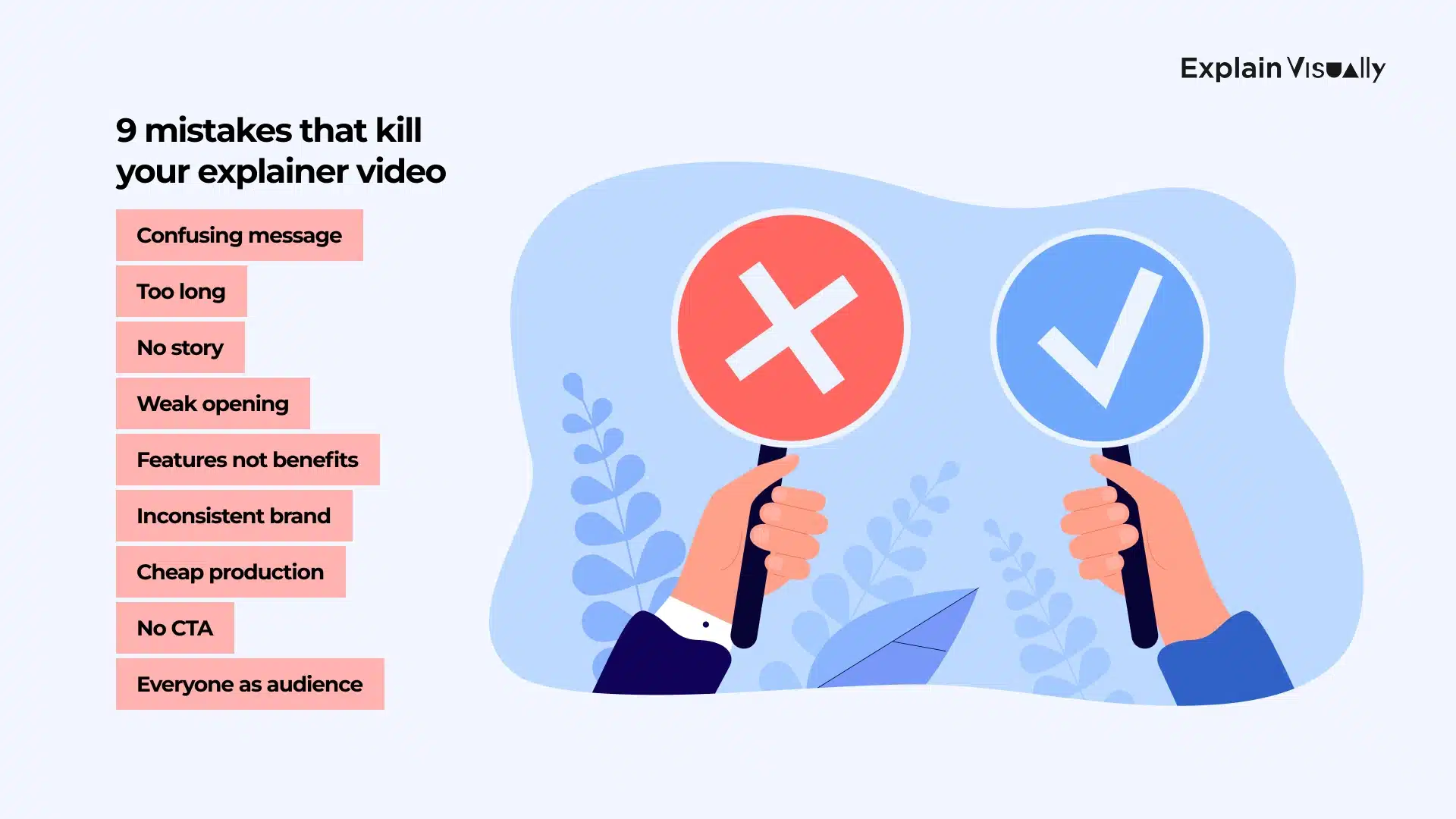
1. Confusing message. You finish watching and think “but what do they actually do?” If that’s the viewer’s reaction, you’ve failed. Strip everything down to one core idea.
2. Too long. We’ve all clicked away from videos that meander past 90 seconds. Keep it tight. If you have more to say, make multiple videos instead of one bloated mess.
3. No story (bad explainer video template). Feature-dumping bores people. Start with a real problem someone recognizes, show your solution, explain it. People remember stories. They forget feature lists.
4. Weak opening. Seven seconds. That’s your window. If you open with “today we’d like to discuss…” you’ve already lost half your audience. Start bold:
– a shocking stat,
– a relatable frustration,
– a question that makes people lean in.
5. Benefits buried under features. “Our tool has machine learning” is meaningless. “Save 10 hours a week” gets attention. Talk about what it does for the user, not what’s under the hood. In an interactive explainer video, lead with the outcome the viewer wants — then show the path, no jargon required.
6. Branding that looks like someone else’s. Your video should sound and look like you. Inconsistent colors, tone, style? Viewers won’t remember who made it.
7. Production that looks cheap. Grainy video, muffled audio, jerky animation. It screams “we didn’t care enough.” Quality production doesn’t mean big budgets it meanscrisp fundamentals.
8. No clear next step (call to action). “Learn more” is useless. Tell people exactly what to do: start a trial, book a demo, download something. Give them momentum.
9. Making it for everyone. Videos for everyone are videos for no one. Know who you’re talking to and speak directly to them.
Get started video creation with the best animation studio. Let’s create engaging explainer videos!
Right, we’ve covered extensive ground from iconic examples that changed marketing history to practical applications that drive sales. You’ve seen how Dropbox, Crazy Egg, Slack, and others leveraged explainer videos to achieve remarkable growth. You understand the benefits, know what mistakes to avoid, and recognise how these videos fit into your marketing strategy. Now it’s your turn to use an interactive explainer video to turn qualified interest into measurable action across your funnel.
The question now is: what’s your next step?
If you’re ready to harnessthepotential of animated videos for your business, we’d love to help.
At Explain Visually, we specialise in transforming complicated messages into engaging visual stories. Our process ensures your video look good and it achieves your business objectives.
Ready to discuss your project andvideo creation? We’ll consult with you, understand your needs, and show you how an expertly crafted explainer video clips can transform how you communicate with your audience. Let’s create something good together. Not only the great explainer video, but… the best explainer video!
𝐄𝐱𝐩𝐥𝐚𝐢𝐧 𝐕𝐢𝐬𝐮𝐚𝐥𝐥𝐲 – 𝐁𝟐𝐁 𝐚𝐧𝐢𝐦𝐚𝐭𝐢𝐨𝐧 𝐬𝐭𝐮𝐝𝐢𝐨:
• We create whiteboard explainer videos for businesses
• We create corporate explainer videos
• We create visual storytelling for companies
