
Imagine you are sitting comfortably on a plane, reading a book. Suddenly you feel turbulence that is much stronger than usual. You start to get anxious, especially since you see people around you panicking.
Then you hear the captain’s voice from the speakers: “Please remain calm and read our safety card in silence. We will be preparing for a water landing”.
With trembling hands, you grab the card and try to figure out what to do. But all you see are a few pages written in tiny text that you can’t decipher as people cry and scream in the background.
Absurd, right?
Less than 100 years ago, that’s exactly what it looked like – the first safety cards contained only text. Only later did pictures and illustrations come along. [1]

Less than 100 years ago, boarding passes contained mostly or only text, and were less readable than today’s pictorial instructions. Source: link
Illustrations are not always understandable
Today, of course, it is enough that you look at the illustrations and immediately know where the life jacket is, what position to take during contact with the ground and how to exit the plane if instructed.
At least in theory.
In 2008, the U.S. Federal Aviation Administration (FFA) conducted a survey on the understanding of safety instructions.
Passenger interpretations were surprising.
For example, some respondents thought the woman depicted in one illustration was wearing a parachute, not a life jacket. From another illustration, they concluded that passengers should strip naked before evacuating.
The following illustration also posed a problem for the researchers.
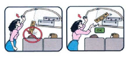
How would you interpret this image? There were a variety of responses to the FFA survey, including “something about falling luggage” and “ask a fellow passenger where you can put your luggage to fit”.
The correct answer is “be ready to catch falling items by opening the baggage compartment”. [2]
So what can be done to avoid causing such misunderstandings?
Features of effective illustrations
The cause of misunderstanding illustrations is lack of context. In a previous article on medical instruction, we talked about this in more detail using the example of putting on a bandage.
This is somewhat reminiscent of the game of puns.
In puns, you are given a slogan and you need to convey it to your team using an illustration. The challenge is to capture the characteristics of the item. That is, for example, drawing a life jacket so that it does not resemble a parachute. The whole trick is to create an illustration so that it is 100 percent understandable.
If the illustrations in the puns were captioned, it would be too easy to guess what they meant. That’s why words are not allowed in the game. But in the instructions, we want to make it easy for the reader to understand!
The conclusion is that if we want to make our visuals easier to understand, we need to add an adequate caption.

Sometimes an adequate caption next to a picture helps to understand it.
This is not just a colloquial observation. In 1982, Levie and Lentz reviewed studies comparing reading comprehension without and with illustrations. They concluded that pictures increase comprehension of text only if they relate to the text.
If the pictures have no connection to the text, they will not affect comprehension. Similarly, if the pictures contain too many details, the reader does not know what to pay attention to.
Levie and Lentz cite a study that solved this clearly by marking key elements in illustrations, e.g. with a different color or arrows. [3]

Clearly marking key elements in instructional illustrations, e.g., with a different color or with arrows, facilitates comprehension.
It follows that illustrations, to be effective:
- they must be well matched to the text;
- they cannot be too detailed;
- they should draw attention to the most important elements specified in the text.
Increasingly, airlines are taking this into account. While no doubt illustrated boarding passes are not the ideal solution, they are the best currently available.
On the one hand, the lack of captions makes them more universal – everyone should understand them, regardless of language or reading skills.
On the other hand, however, this advantage is also a disadvantage. Text accompanying more complex illustrations reduces the danger of misinterpretation and makes it easier to understand the meaning of the illustration.
This is why it is such a challenge to choose the right visualization.

Drawing instructions for peeling a mango, which we created for a fruit importer.
Photos vs. illustrations
Before illustrations replaced text on boarding passes, photos were used.
However, as numerous studies on boarding card design, such as those by Dwyer (1967), have shown, they show the advantage of boarding cards with illustrations over those with photographs. The same conclusions were reached by FFA in the aforementioned study testing the understanding of security cards. [2]
Why do photographs perform worse?
“Realistic photographs may be effective in drawing attention, but because the camera captures so many details, the details may interfere with comprehension”, writes Peter S. Houts. [4]
Imagine that you want to change the settings on your radio.
In the picture illustrating the first steps, you see a bunch of buttons. It takes you a while to figure out which button to press and in what order. What if you removed all the unnecessary elements from the picture and clearly marked, for example with a color, the button you are looking for? Wouldn’t that make your task easier?
Drawing illustrations have the advantage over photos in that they focus our attention on what we should work on at the moment. That is why they are more effective.
The key to a well-chosen illustration lies in its simplicity and clarity. As Antoine de Saint-Exupéry said:
“It seems that perfection is achieved not when nothing more can be added, but rather when nothing can be taken away.” [5]
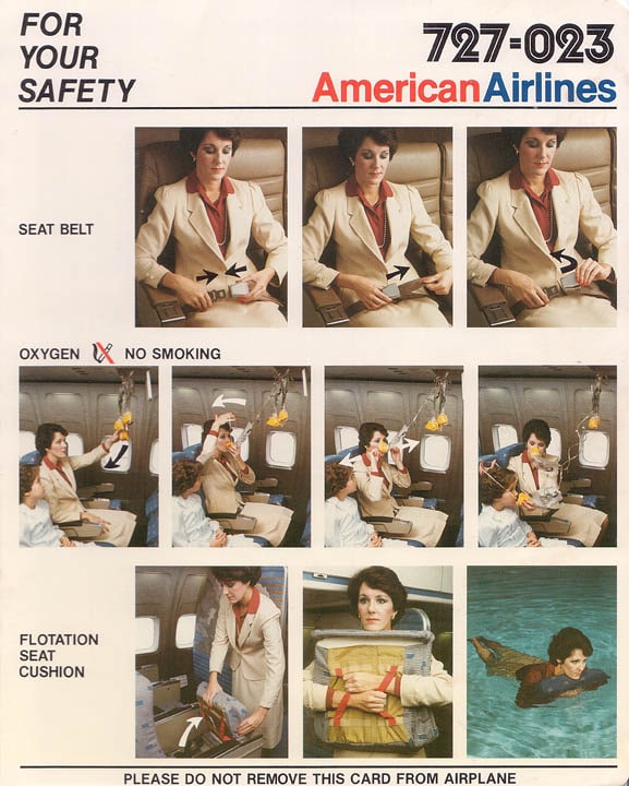
At one time, photographs were also used on boarding passes, but cartoon illustrations proved more effective and replaced photographs. Source: link
Illustrations vs. instructional video
Few companies understand the creation of illustrated instructions better than IKEA.
In 1956 Gilis Lundgren, one of the brand’s designers, designed a three-legged table in the shape of a leaf. He wanted to pack it in his car, but it wouldn’t fit.
The designer went to great lengths, trying to squeeze the table inside. It was no use. Finally, he found a solution – he filed down the table legs. “Folded” furniture easily fits into a car.
Thanks to the instructions added later, assembling IKEA furniture became possible for everyone. [6]
Illustrated instructions have surrounded us since childhood – toddlers use illustrations to assemble a toy from Kinder Surprise. Older children look at an illustration to build an airplane out of LEGO bricks. Adults use instructions to assemble furniture from IKEA.

Toddlers use illustrations to assemble a toy from Kinder Surprise. Older children look at an illustration to build an airplane from LEGO bricks. Adults use instructions to assemble furniture from IKEA.
But instructions are not all the same!
While assembling a three-legged table should not pose any problems, a closet can turn out to be a challenge. After all, furniture has undergone quite a metamorphosis over the years and, consequently, the instructions of its assembly have also become more complicated.
Of course, assembling IKEA furniture is easier than assembling furniture without pictorial instructions.
This is how Paul Ballard, CEO at 3di, a company that specializes in creating technical documentation, explains it:
– It’s not because the manual itself is poor. It’s because the product itself is too complicated. [7]
Up to a certain point, pictorial instructions work better than instructional videos, such as the aforementioned boarding passes or hand bandaging instructions. As the level of difficulty and complexity of the instructions increases, instructional videos perform more favorably.
Explainer videos are ideal for this purpose. For example, to provide instructions on health and safety rules in a company or plant.
Cultural factors
Joe Navarro, a former FBI agent, once recounted how someone alerted the agency to an alleged foreign spy. They watched the suspect for a long time, but found no leads on him. One day, the agents were watching a video that showed him leaving a flower shop.
At one point, Agent Navarro said “stop!” He noticed a small detail that turned out to be crucial to solving the case. The man was holding a bouquet of flowers upside down, which is typical of Eastern Europeans; in America, you always hold the bouquet the other way. This was enough to convince the spy to betray his profession during interrogation. [8]
Probably without an explanation of the reason for the holding, we would not see anything strange in this story. This is because in our cultural circle, holding flowers in this way is normal.
On a daily basis, we don’t realize how much the culture we grew up in influences our understanding of different messages. In business, however, it can make a difference.
Dowse and Ehlers studied how black Africans reacted to standardized illustrated medication instructions produced by the U.S. Public Health Service.
They contrasted these with drawings created by local black South Africans, where low levels of literacy were reported.
Respondents preferred the drawings prepared by local residents.
When we were developing this animations for Time4Tea, we had to take into account the subtle cultural differences as the animation is shown in a few different countries across the globe.
Cultural sensitivity plays an important role when creating cartoon instructions and instructional videos.
Dowse and Ehlers noted that illustrations of people who are similar to us and objects we are familiar with help us follow instructions better. We do not focus on looking for differences between what we know and what the illustrations represent, and we do not get distracted. We identify more easily with an illustration.
“Because we acquire our ability to interpret pictures largely without intent or awareness, we may be misled into supposing that our mode of picturing is truly the universal language. In fact, pictures are heavily laden with culture-bound conventions that must be learned if they are to be understood.’’, wrote Levie in a summary of research on the use of illustrations in education. [4]
Even seemingly small elements that we don’t pay attention to when looking at materials that are part of our culture have significance. Such as furnishings, placement of store signs, the distance between characters, etc.
When we were developing an animation series for Nestlé about a weight-loss cure for the Saudi Arabian market, we had to take these subtle differences into account.
The heroine of the animation needed to be modern to get the message across to young women, the company’s potential customers. On the other hand, it needed to be kept within certain limits, so as not to shock too much.
The talent’s outfit, the size of her eyes, and her weight were all important factors and were discussed with the client.
The goal was for the viewer to identify with her so that attention was focused on the product, and not on the specific appearance or behavior of the character. This allows the video to fulfill its role.

When creating an instructional video: 1. show the most important points of the instructions in illustrations. 2) Limit elements that may be distracting. 3) Sign the drawings or attach written instructions. 4) Keep cultural aspects in mind.
Summary
Adding simple pictorial illustrations to instructions increases the recipient’s interest and influences the amount of information they remember.
Whether you want to explain to someone how to implement a new procedure in your company, fix a printer, treat a wound, or fold a chair – remember to use illustrations as well as words.
1) Use illustrations to show the most important points in the instructions.
Think about what is complicated and needs to be illustrated.
2) Limit elements that can be distracting.
Illustrations work better than photographs. Simple drawings are more effective than complex ones because they contain only the necessary elements and minimize the likelihood of misinterpretation
3) Sign the drawings or include written instructions.
A combination of text and pictorial illustrations usually produces better results than using illustrations alone.
4) Keep cultural aspects in mind.
Remember that people will understand instructions better if they see familiar characters and situations in the illustrations with which they can identify.
If you are interested in how we use this knowledge in practise and how we can help You, contact us

She studied Japanese and linguistics at the University of Warsaw, but it was her work for an NGO, first as a volunteer, and then professionally, that shaped her interests. As a coordinator of one of the campaigns she organized conferences, meetings at the Parliament, fashion shows, made interviews with politicians and celebrities. She also took care of social media and marketing. Now she is responsible for marketing and running social media at ExplainVisually.
Bibliografia
[1] Those Safety Instructions in Your Airplane Seat Pocket? Nobody Understands Them: https://www.airspacemag.com/daily-planet/cards-180950298/
[2] Federal Aviation Administration, Effective Presentation Media for Passenger Safety I: Comprehension of Briefing Card Pictorials and Pictograms, 2008
[3] W.H. Levi, R. Lentz, R., Effects of text illustrations: a review of research w: Educational Communication and Technology Journal 30(4), 1982
[4] Peter S. Houts, Cecilia C. Doak, Leonard G. Doak, Matthew J. Loscalzo, The role of pictures in improving health communication: A review of research on attention, comprehension, recall, and adherence w: „Patient Education and Counseling” nr. 61, 2006
[5] Antoine de Saint-Exupéry, Ziemia, planeta ludzi, 1939
[6] Paul Leinwand, Cesare R. Mainardi, Strategy That Works: How Winning Companies Close the Strategy-to-Execution Gap Hardcover – February 2, 2016
[7] Inside the world of instruction manuals: https://www.bbc.com/future/article/20180403-inside-the-world-of-instruction-manuals
[8] Former FBI Agent Explains How to Read Body Language: https://www.youtube.com/watch?v=4jwUXV4QaTw
