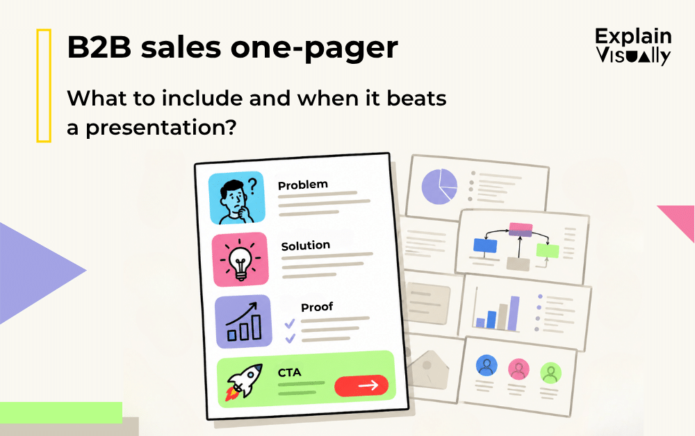
A B2B sales one-pager has one job: help a potential buyer understand the value of your offer without asking them to open a deck, join another meeting, or read a long PDF.
That sounds simple. But many one-pagers fail because they try to behave like miniature presentations. They squeeze in too many messages, too many charts, too many claims, and too little hierarchy.
A strong sales one-pager is not a compressed brochure. It is a single-page decision aid. It should show who the offer is for, what problem it solves, why it matters, what proof supports it, and what the reader should do next.
What is a B2B sales one-pager?
A B2B sales one-pager is a one-page sales document used to explain an offer, product, service, solution, or business case in a concise visual format.
It is usually shared after a call, attached to an email, used by sales teams during outreach, or handed to internal stakeholders who need to explain the offer to other decision-makers.
A good one-pager for a business should answer five questions quickly:
- Who is this for?
- What problem does it solve?
- What outcome does it create?
- Why should the buyer believe it?
- What is the next step?
If the reader has to hunt for these answers, the one-pager is not doing its job.
What should a B2B sales one-pager include?
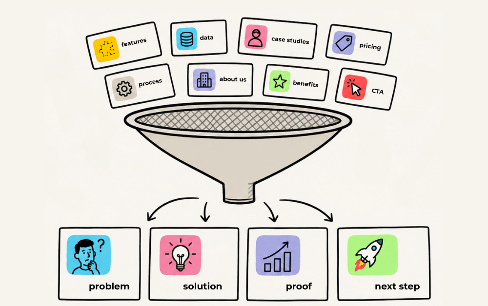
The best B2B sales materials are not necessarily the longest ones. They are the easiest to use. A sales one-pager should include only the information that helps the reader move one step closer to a decision.
1. A clear headline
The headline should communicate the outcome, not just the category.
Weak headline:
“Sales Enablement Platform”
Stronger headline:
“Help your sales team send the right material after every buyer conversation”
The second version tells the reader what changes. It gives the page a direction.
2. A short problem statement
This section should name the buyer’s pain in concrete language. Avoid broad claims such as “companies struggle with efficiency.” Instead, describe the real situation:
“Your sales team sends different decks, different PDFs, and different follow-up explanations, so prospects receive an inconsistent version of the offer.”
That is easier to recognize than abstract business language.
3. The offer in one sentence
Before you show features, write one plain sentence that explains what the offer is.
For example:
“Our solution gives sales teams one approved, visual document that explains the offer, proof points, process, and next step in a format buyers can forward internally.”
This sentence acts as the anchor for the whole one-pager.
4. Key benefits
Use three to five benefits maximum. Each benefit should be specific enough to be useful.
Instead of:
“Better communication”
Use:
“Shortens follow-up emails because the buyer receives the full offer summary on one page.”
Instead of:
“More clarity”
Use:
“Helps non-technical stakeholders understand the business value without reading the full technical deck.”
5. Proof points
A B2B sales one-pager needs credibility. But credibility does not mean adding every available statistic.
Choose proof that supports the central promise:
- A short case study result.
- A client logo section.
- A before-and-after comparison.
- A simple metric.
- A testimonial.
- A concrete example of use.
If you include numbers, explain what they mean. A chart without interpretation is decoration.

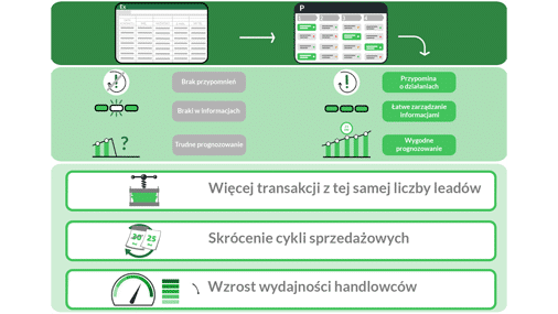
The SGH infographic with a chart, icons, and a report-style layout as an example of data visualization.
6. A simple visual explanation
This is where many one-pagers become much stronger. A small diagram can explain what a paragraph cannot.
Useful formats include:
- A three-step process diagram.
- A before-and-after comparison.
- A buyer journey map.
- A simple flowchart.
- A “what you get” visual breakdown.
- A table comparing the current situation with the improved situation.
The visual should not fill space. It should reduce effort.
7. Scope or package details
The reader should understand what is included. This does not have to be a full pricing page. A short “What’s included” box is often enough.
For a service, this could include deliverables, timeline, formats, workshops, or implementation steps.
For a product, this could include core modules, integrations, support, onboarding, or reporting.
8. A clear call to action
End with one next step. Not five.
Good examples:
- “Book a 20-minute fit call.”
- “Send us your current deck and we will suggest a one-page structure.”
- “Ask for a sample one-pager for your industry.”
The CTA should match the buyer’s stage. A cold prospect may not be ready for a demo, but they may be ready to review an example.
How to create a sales one-pager: the right information hierarchy
The layout of a B2B sales one-pager matters because readers scan before they read. The page should guide the eye from the most important message to supporting details.
A practical hierarchy looks like this:
Top section: headline, short subheadline, and one visual cue that shows the category or outcome.
Middle section: problem, solution, benefits, and diagram.
Proof section: result, testimonial, logo, data point, or use case.
Bottom section: scope, next step, contact details, and CTA.
This creates a natural reading path: “This is for me. This solves my problem. I understand how it works. I believe it. I know what to do next.”

The BPS infographic showing the visual structure of information about a mortgage loan.
How to choose the right data for a sales one-pager
A common mistake is adding data because it exists. In a one-page document, every number must earn its place.
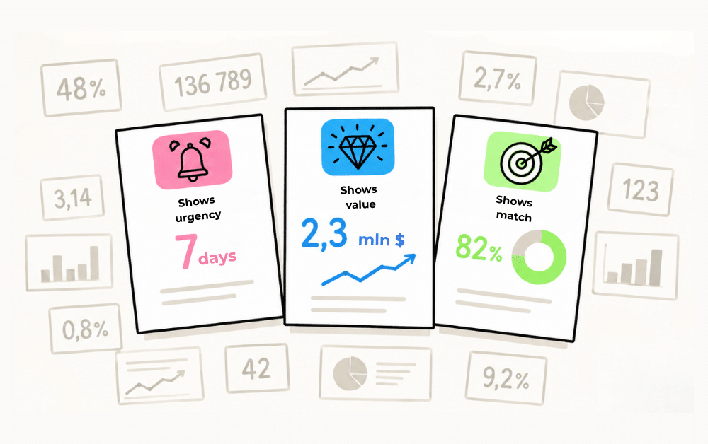
Use data when it does one of three things:
1. It proves urgency.
Example: “Sales reps spend too much time recreating materials instead of using approved assets.”
2. It proves value.
Example: “The campaign generated qualified leads at a lower cost than the previous approach.”
3. It proves fit.
Example: “Built for B2B SaaS teams with long sales cycles and multiple stakeholders.”
Avoid data that needs a long explanation. If a chart requires three paragraphs of context, it probably belongs in a presentation, not a one-pager.
How to use icons and diagrams in B2B sales materials
Icons are useful when they help the reader group information. They are harmful when they become visual noise.
Use icons for:
- Repeating categories, such as time, cost, risk, team, process, data, or support.
- Feature groups.
- Industry segments.
- Stages of a process.
- Types of stakeholders.
Avoid icons that are too generic. A rocket, target, trophy, or handshake may look polished, but often says very little.
Diagrams are more powerful than icons when you need to show relationships. For example, if your offer connects sales, marketing, and customer success, a simple triangle or workflow can make the system visible in seconds.
The rule is simple: use icons to label, use diagrams to explain.
One-pager vs presentation: when does a one-pager work better?
The one-pager vs presentation question is not about which format is better. It is about the sales situation.
A B2B sales one-pager usually works better than a presentation when:
- The buyer needs a quick summary after a meeting.
- The material will be forwarded internally.
- The prospect is early in the decision process.
- The offer is clear enough to explain in one page.
- Salespeople need a consistent follow-up asset.
- The goal is to support recall, not run a full pitch.
A presentation works better when the topic needs sequencing, discussion, demos, or a more detailed business case.
Think of the one-pager as a map. Think of the presentation as a guided tour. If the buyer only needs orientation, send the map. If they need persuasion step by step, use the tour.
The most common mistakes in a B2B sales one-pager
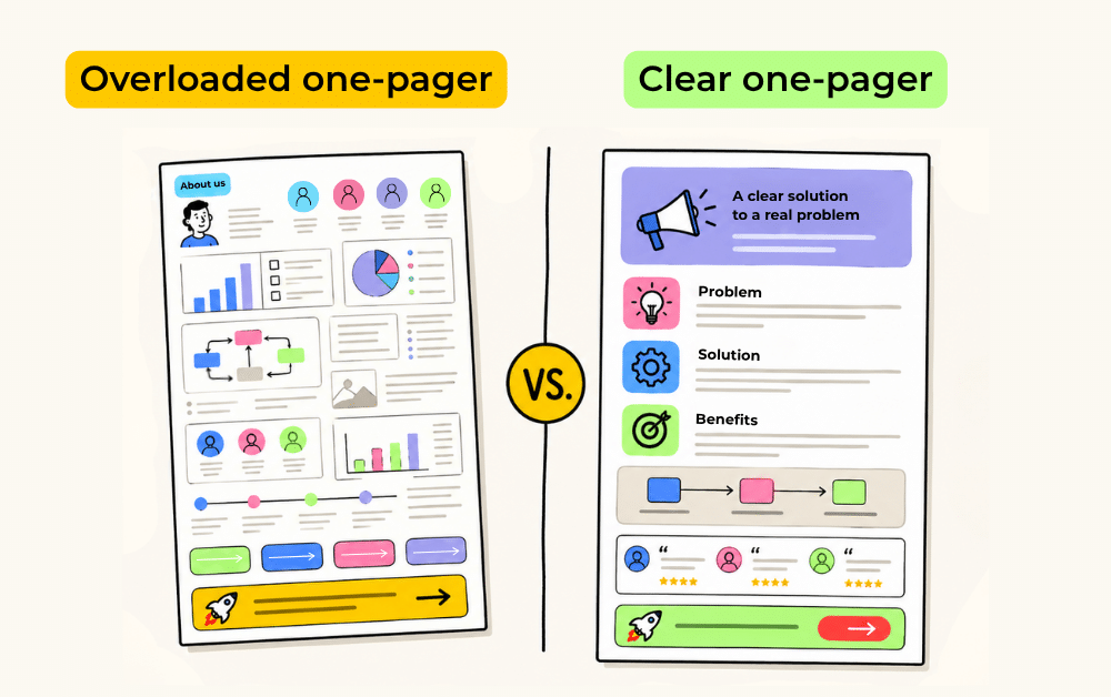
Mistake 1: Trying to include everything
A one-pager is not a storage unit for all sales arguments. It should contain the strongest message, not every message.
Mistake 2: No visual hierarchy
When all sections look equally important, the reader does not know where to start. Use size, spacing, color, and placement to show priority.
Mistake 3: Starting with company information
Many one-pagers open with “About us.” Buyers usually care first about their own problem. Company credibility can come later.
Mistake 4: Too many buzzwords
Phrases such as “innovative solution,” “end-to-end support,” and “tailored approach” are too vague unless supported by specifics.
Mistake 5: Decorative visuals
Icons, charts, and illustrations should clarify the message. If removing a visual does not make the page harder to understand, the visual may not be needed.
Mistake 6: No next step
A one-pager without a CTA creates interest but not action. Always tell the reader what to do next.
Example structure for a B2B sales one-pager
Here is a simple structure you can adapt:
Header:
Logo, headline, one-sentence value proposition.
Section 1: The problem
Two or three lines describing the buyer’s situation.
Section 2: The solution
A short explanation of what you offer and how it changes the situation.
Section 3: How it works
A three-step diagram:
- Diagnose.
- Design.
- Deliver.
Section 4: What the buyer gets
Three to five deliverables or benefits.
Section 5: Proof
One result, testimonial, short case example, or client logo row.
Section 6: Best fit
Who this is for and when it is most useful.
Section 7: CTA
One clear next step with contact details.
Do you need a clearer B2B sales one-pager?
A good B2B sales one-pager helps your buyer explain your offer when you are not in the room. It gives sales teams a consistent asset, helps prospects remember the key message, and makes complex offers easier to discuss internally.
At Explain Visually, we work on exactly this type of communication challenge: turning complex information into clear visual materials. Our work includes explainer videos, whiteboard animations, corporate explainer videos, visual storytelling, illustrations, infographics, diagrams, and other formats that help companies explain products, services, processes, and ideas more clearly.
If you are planning to create a sales one-pager, refresh your B2B sales materials, or turn an existing presentation into a clearer one-page format, get in touch with us. We will be happy to suggest a visual structure that fits your offer, audience, and sales process.
- We create whiteboard animations for businesses
- We create corporate explainer videos
- We create visual storytelling for companies
FREQUENTLY ASKED QUESTIONS:
What is a B2B sales one-pager?
A B2B sales one-pager is a single-page document that explains a product, service, solution, or offer in a concise visual format. It is usually used by sales teams during outreach, follow-up, internal sharing, or buyer education.
What should a sales one-pager include?
A sales one-pager should include a clear headline, problem statement, short offer explanation, key benefits, proof points, simple diagram or visual structure, scope of the offer, and one clear call to action.
How long should a B2B sales one-pager be?
It should fit on one page. The format can be A4, letter size, or a digital scrolling page, but the principle stays the same: the reader should understand the core message without opening a long deck or document.
When is a one-pager better than a presentation?
A one-pager works better when the buyer needs a quick summary, when the material will be forwarded internally, when the offer is already partly understood, or when the sales team needs a consistent follow-up asset. A presentation is better for live pitching, demos, workshops, and complex business cases.
What is the difference between a one-pager and a sales deck?
A one-pager gives a compact summary of the offer on one page. A sales deck explains the offer across multiple slides, usually with more context, sequencing, and detail. A one-pager is easier to scan and forward. A deck is better for guided explanation.
How do you create a sales one-pager?
Start with one core message. Define the target buyer, problem, outcome, proof, and next step. Then arrange the page in a clear hierarchy: headline, problem, solution, diagram, benefits, proof, and CTA. Remove anything that does not support the main decision.
Should a B2B sales one-pager include pricing?
It depends on the sales process. If pricing is simple and helps qualify buyers, include it. If pricing depends on scope, use a “starting from,” package range, or “request a quote” CTA. Do not let pricing dominate the page unless it is one of the main reasons to choose the offer.
Are icons useful in a sales one-pager?
Yes, but only when they help organize information. Icons work well for categories, benefits, process steps, or stakeholder groups. They should make the page easier to scan, not just decorate it.
What diagrams work best in a B2B sales one-pager?
The most useful diagrams are simple process flows, before-and-after comparisons, stakeholder maps, timelines, feature breakdowns, and “how it works” visuals. The best diagram is the one that reduces the amount of text needed to understand the offer.
What are the biggest mistakes in one-pager design?
The biggest mistakes are overcrowding the page, using vague claims, adding too many visuals, hiding the main message, starting with company information instead of the buyer’s problem, and forgetting a clear CTA.